 March
13
March
13
Two Key Considerations When Building a Dashboard: Interesting vs. Useful
I love data.
Who doesn’t nowadays? We are in the middle of a big data revolution with technology solutions and have so much data accessible to us. With that, many of us are asked to provide our leadership with a dashboard to measure business performance metrics and other key performance indicators.
This has happened to me numerous times.
- While I served as board chair for a local nonprofit, I created a dashboard to track the impact of the women we served, our volunteer base, and our donors.
- While working in a boutique consulting firm, I developed a business development dashboard that integrated with Salesforce to track opportunities in the pipeline.
- As the lead of a PMO, I created a Manager’s Dashboard for tech leads to have visibility into their team’s forecasts in a matrixed organization.
- I created a report to provide the Chief Technology Officer with a view of how busy our resources are (utilization), what type of work they were doing (development vs. support & maintenance), and the clients benefitting from our organization’s work.
- In my current Tech Strategy & Business Operations role, I am building a series of dashboards to show the skills across the technology organization.
I’ve done all of this, but I have never explicitly had “develop dashboards” or “analyze data” in my job description. As we leverage systems and data more, I suspect data analysis will be an expectation of multiple IT delivery roles.
Let’s build a dashboard!
When considering what metrics to include in a dashboard, it is likely that you have more metrics than space available. No doubt your leadership wants to see every metric available to them.
We’ve all seen that cluttered dashboard. Too many metrics. Not organized logically. And sometimes with a duplication in KPIs that results in confusing or even conflicting analysis.
One of the best pieces of advice I’ve received related to data and designing dashboards was from a colleague on a team I led while implementing a supply chain forecasting tool. We were trying to identify KPIs to measure forecast accuracy by comparing the current model with the model we were implementing.
We had defined the problem and the target audience, and we knew the format in which we were going to deliver the report. The remaining question was “what metrics should we include in the final dashboard?”
My colleague suggested that I ask myself 2 questions:
1. Is it interesting?
2. Is it useful?
Like most good advice, this is so simple, yet it was a big A-HA moment for me and I’ve used it in the dashboards that I’ve built since.
Question #1: Is it interesting?
You could answer “yes” to this question for most all of the data you can collect. Ask a leader in your organization, and they can list off interesting metrics that they would love to know more about. For example, it would be great to know what zip codes our donors come from. I would love to know how many resources are working on each project. These are both interesting metrics about the industry and operation.
If you have defined the problem well, most of your metrics and KPIs will be interesting to start off. One approach I use to define KPIs is to anticipate questions from leadership. So this becomes a circular reference – if I’ve identified that leadership wants to know the answer to this question, then, by definition, it is interesting.
I think the “is it interesting?” question becomes applicable over the lifetime of the dashboard. Later on, this question may help you tailor the dashboard. Perhaps the metric has been fully socialized and no longer needs to be included. Or the structure of the organization has changed in a way where the metric can not really change. For example, if the resources in this department are fully allocated to a client and only work on that client’s projects, then looking at the work they do by client may not be interesting. However, if you are in a matrixed organization in which resources can work on projects for other clients, then maybe this is an interesting metric.
In either scenario, I find it good practice to first review the metrics and KPIs to determine if they are interesting to leadership and other key stakeholders.
Question #2: Is it useful?
Now this is where we begin to separate the wheat from the chaff. And this is how you can add value with your dashboards.
I have leveraged the “is it useful?” question as a tool to focus dashboards. I have found that the simpler the dashboard, the easier it is to socialize across the organization and gain support and adoption of the KPIs. When I have been in situations in which I did not ask this question, I found myself chasing down information that proved to have little value or was satisfied by another metric. This causes an unnecessary administrative burden on the organization that waters down the value (and reputation) of your dashboard.
Some examples of “is it useful?” questions are:
- Will understanding the trends for your KPIs help you predict behavior?
- Can you make decisions based on the data?
- Does it explain or demonstrate challenges in your business?
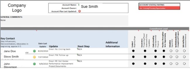
In the dashboard that I built for business development for a consulting firm, I included stoplight indicators to report on account activity for opportunities in the pipeline. This was useful for the Atlanta leadership team because they could immediately focus on accounts that needed attention and identify opportunities that may have been stuck in the pipeline.
My VP needed a Business Development process and way to track activities, priorities, and opportunities in the pipeline.
Bonus Question: Is it actionable?
In some situations, I would also recommend asking the question ”is it actionable?” For example, in the nonprofit, although analyzing zip codes was interesting to understand our donor base, and useful for targeting our appeals, the truth was our organization size (at the time) could not sustain the administration of this marketing approach. In other words, although the information met the definition of “useful”, even with this information, we would not be able to take action.
Once you ask the “is it useful?”, you likely have a more manageable set of metrics and KPIs that you can use to build your dashboard. There’s still a lot of work to do. In addition to defining your data model (and any cleansing and normalization that you may have to perform), you still have to identify the story you are telling, select your visuals, and design your dashboard.
What next?
More and more, we are being asked to leverage the data available to us to manage our business. In some functions, this includes building a dashboard or some combination of metrics and key performance indicators. More broadly, managers are asked to make data-driven decisions to manage their work and/or improve their operations. I certainly hope that by sharing these 2 questions – #1.) Is it interesting? and #2.) Is it useful? – you can immediately apply them to any metrics you are considering.
There are tons of resources available for data analysis and visualization. I recently completed General Assembly’s Data Analysis Circuit, and highly recommend the course. It was an exceptional foundation for data analysis and data visualization and I especially liked the hands-on exercises that allowed students to practice what we learned. In addition, I also recommend “Storytelling with data” by Cole Nussbaumer Knaflic (www.storytellingwithdata.com). This is an amazing resource and I often refer to this book when building dashboards or looking to improve existing dashboards.
Please share…
Do you have any advice for building dashboards or resources that you’d recommend? Please share – we could all use more tools in our toolbox.
